Audience
New hires within their first 90 days, when collaboration habits, team trust, and role confidence are still forming.
New hires within their first 90 days, when collaboration habits, team trust, and role confidence are still forming.
Ripple Crest depends on effective cross-team collaboration, yet new hires may understand those expectations without knowing how to apply them under pressure.
Common challenges include holding back in meetings, avoiding productive disagreement, and focusing only on individual work during shared deadlines. These behaviors can slow time-to-productivity, weaken team trust, delay project work, and affect client confidence.
Research on onboarding, psychological safety, and team communication reinforced the need for realistic practice rather than additional information.
I designed a self-paced workplace simulation that gives learners a safe place to practice collaboration decisions before they carry real consequences.
A scenario-based experience was the right solution because the gap involved judgment under pressure, not missing knowledge. The simulation complements policy training,
systems instruction, role-specific onboarding,
and manager check-ins.
A quick view of how the solution moves learners through three realistic workplace decisions before bringing those choices together in a cumulative 90-day review.
Contribute during a project kickoff meeting.

Help resolve a conflict between speed and quality.

Support the team during a deadline crunch.

Review the long-term impact of those choices.

Three design elements shape every decision point, combining realistic consequences, optional mentor support, and cumulative assessment.
Choices affect teammates, the client, and project status.
Learners can access just-in-time guidance without being given the answer.
Decisions across all three scenarios carry forward into the final performance review.
I used an ADDIE-aligned process, moving from performance analysis and action mapping through design, development, prototype review, and formative evaluation. Because this was a concept project, implementation focused on producing, testing, and refining the eLearning experience rather than completing an organizational rollout.
Guiding Design Question
What must the learner do differently on the job, and how can this experience provide meaningful practice?
This question kept the project centered on performance rather than information delivery.
I used AI selectively across research, problem-solving, media production, and technical refinement. These tools accelerated production, but the performance goal, scenario logic, accessibility decisions, and quality control remained designer-led.
I used Cathy Moore's action mapping approach to focus the project on workplace behavior rather than information recall — tying a single business goal to the specific things a new hire needs to do on the job.
Proposed business goal
Decrease time-to-productivity for new hires by 20% within their first 90 days by preparing them to collaborate effectively during project meetings, team conflict, and deadline pressure.
A concept-project target used for design alignment, not a verified business result.
Priority Behavior 01
Build on a teammate’s contribution and link it to the client or project objective.
Priority Behavior 02
Acknowledge different perspectives and propose a balanced path forward.
Priority Behavior 03
Step in when unfinished work puts the team’s deliverable at risk.
Why this priority?
01 · Shared-goal alignment
Keeps meetings focused on the shared project goal, reducing drift, misalignment, and wasted effort.
Why this priority?
02 · Productive compromise
Helps teams resolve competing priorities without stalling progress or escalating conflict.
Why this priority?
03 · Team-first delivery
Protects shared deadlines when individual priorities compete with the team’s most urgent deliverable.
Project Action Map: Connects the proposed business goal to observable workplace behaviors, with the three priority actions carried forward into the scenario design.
I used backward design to map the narrative, learner choices, consequences, mentor support, media direction, and programming around the three target behaviors. Each scenario asks the learner to apply one of them through a realistic decision.
I embedded Gagné's Nine Events of Instruction throughout the simulation rather than presenting them as a visible checklist. Together, the events structure how learners enter the experience, connect it to prior workplace knowledge, practice targeted skills, receive feedback, and carry each decision forward across the 90-day journey.
Gagné Event
Gagné says
How I implemented it
I framed the experience as an investigation into archived workplace decisions.
The opening gives the learner a clear mission and establishes team alignment as the central challenge.
It connects the scenarios to familiar workplace dynamics.
Cinematic Interactive Introduction: The archived-footage opening gains attention, establishes the learner's mission, and activates prior workplace knowledge before the first decision.
Gagné Event
Gagné says
How I implemented it
I built three scenario-based decision points around competing priorities, client expectations, and project support.
Learners can consult Leah for optional, just-in-time guidance.
Learners then independently choose how to respond in each situation.
Mentor Support System: The mentor offers just-in-time intervention while each scenario requires the learner to apply collaboration skills through a consequential workplace decision.
Gagné Event
Gagné says
How I implemented it
I connected each decision to visible effects on team trust, client confidence, and project progress.
Those consequences accumulate across all three scenarios.
The experience culminates in a 90-day performance review that reflects the learner’s overall pattern of decisions.
Storyboard Consequence Sequence: Team, client, and project responses provide feedback while the cumulative review assesses performance.
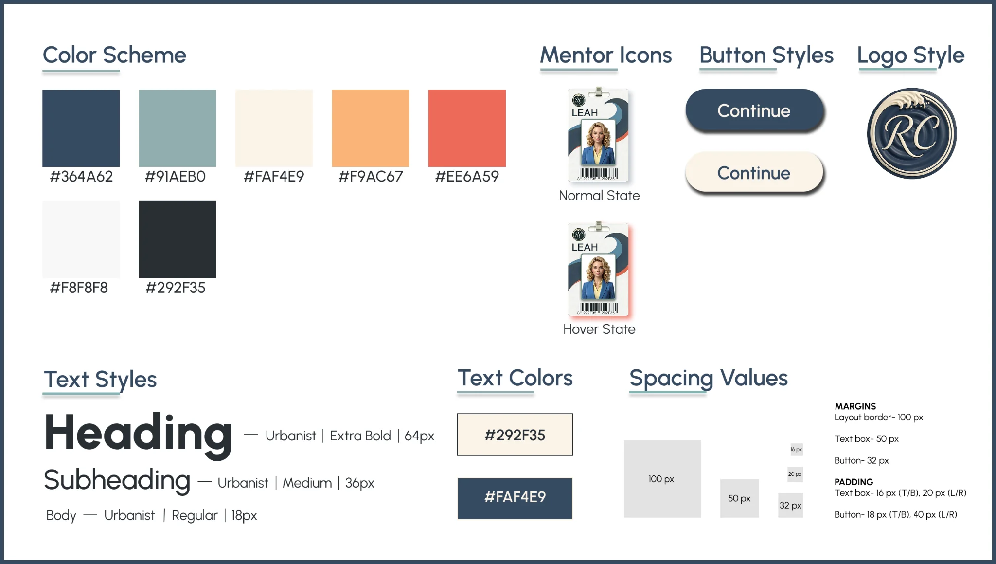
With the visual system established, I moved from early wireframes to high-fidelity Figma mockups before developing the experience.
I applied Mayer's Multimedia Principles to remove nonessential elements and keep the learner's attention on the choice at hand, shaping the actual interface, not just the theory behind it.
01
Prompts, choices, navigation, and mentor support stay in consistent locations across every decision point.
02
Watch messages, phone videos, voice memos, and project trackers make feedback feel authentic.
03
Learners see the effect of a choice immediately — and again later through its ripple consequences.
Visual Mockups: Shows how early layout wireframe concepts evolved into a cohesive visual mockup system for the full learner journey.
After producing high-quality AI images and videos, I built a focused prototype containing an interactive cinematic opening, learner personalization, a meet-the-mentor interaction, the first branching scenario with related positive and negative consequences, and core navigation logic with an overarching ripple theme.
Testing one complete scenario allowed me to gather feedback early, validate a repeatable model, and reduce rework before developing scenarios two and three.
Feedback-Based Revisions
Revision 01
Reviewers found the original surveillance framing unclear and potentially "Big Brother." I reframed it as an authorized archive review with a clearer learner mission.
Revision 02
Extended movement and mentor dialogue delayed the first choice. I shortened Leah's hallway sequence, tightened the meeting setup, and removed nonessential layers.
Revision 03
Some ripple effects didn't clearly connect to the selected behavior. I revised dialogue, client responses, status updates, and on-screen text to strengthen cause and effect.
Revision 04
Revisits produced persistent states and inconsistent transitions. I refined states and revisit properties, added conditional triggers, JavaScript, and consistent navigation patterns.
After validating the interaction model, I expanded it into three branching workplace scenarios with personalized paths and consequences, mentor support, custom media, accessibility features, and a 90-day performance review.
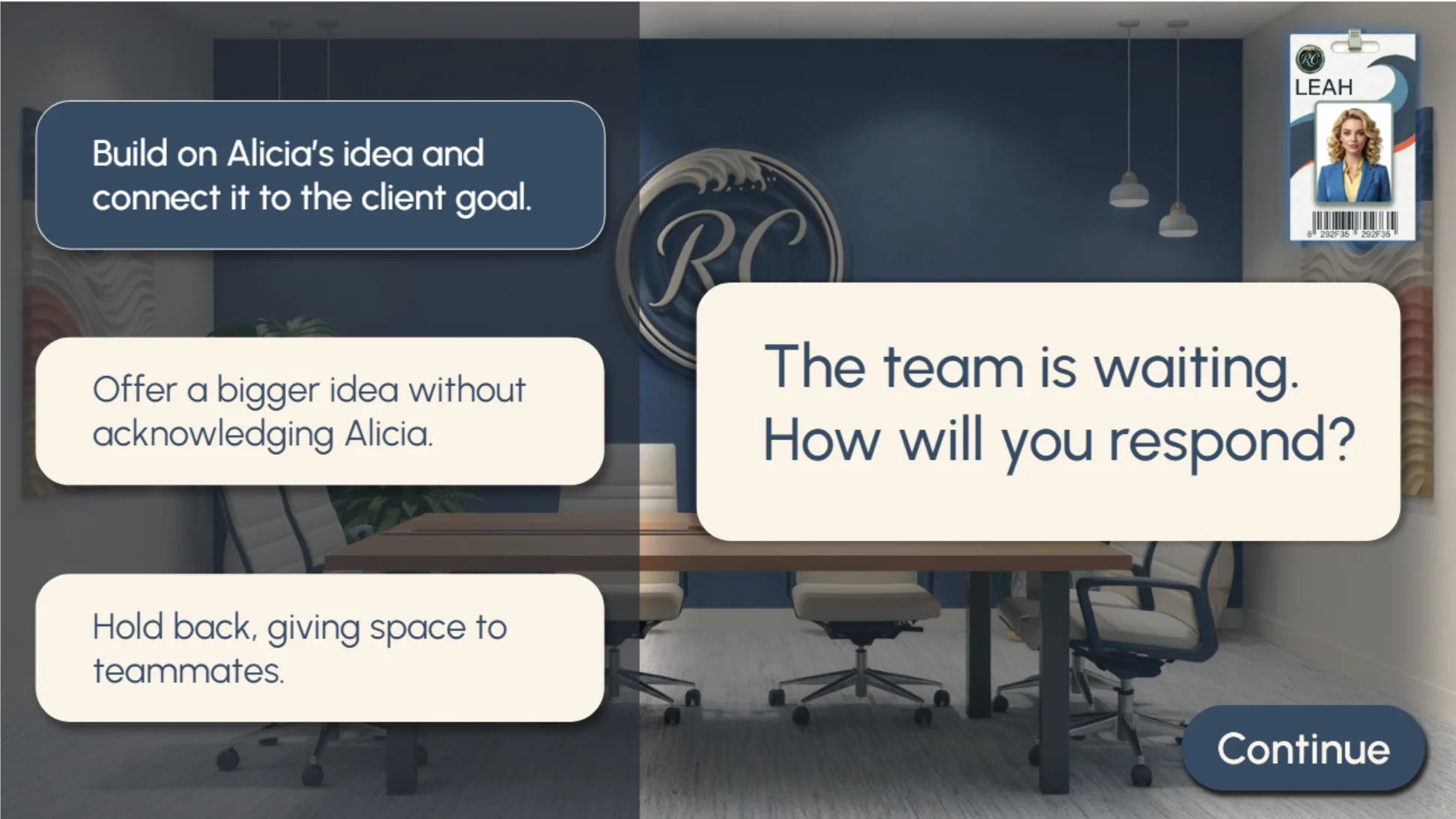
Leah, the onboarding mentor, appears during transitions and remains accessible through a persistent badge. The badge introduces a predictable support feature learners can return to throughout the experience. When selected, Leah offers brief, just-in-time questions that help learners consider people, priorities, and consequences without revealing the strongest choice.
Optional Scaffolding: The left image shows how Leah’s mentor badge is introduced and remains available as an on-demand support feature, while the right image shows what Leah’s guidance looks like when learners choose to access help, allowing them to reflect while retaining ownership of the decision.
Each decision triggers connected workplace responses through team reactions, watch messages, client communications, project updates, and mentor reflections.
Effective choices strengthen trust and momentum, while ineffective choices reveal uncertainty, delay, or client concern before the learner tries again.
Connected Consequences: Immediate reactions and delayed ripple effects show how one workplace decision can influence the team, project, and client.
The learner's performance is tracked across three workplace criteria:
The final review turns those decisions into observable workplace outcomes rather than an abstract quiz score. Evidence from all three scenarios is carried forward into the cumulative 90-day review, which determines whether the learner has demonstrated the three target behaviors consistently. Successful performance unlocks a permanent-role confirmation and positions the learner as a future co-mentor alongside Leah.
Workplace-Based Assessment: The client’s response confirms the impact of the learner’s decisions on the team’s work, while the 90-day review evaluates performance across the same three behaviors practiced throughout the experience.
Formative testing shaped the final build, and a concept project still needs a plan for proving it works. What follows is what reviewers found, what I would measure before rollout, how accessibility was built in, and what I am carrying into the next project.
Reviewers and testers found the scenarios engaging and relevant while identifying opportunities to improve pacing, navigation, visual cues, and feedback clarity.
Addressing those issues resulted in a faster, more predictable experience with clearer connections between learner choices and workplace consequences.
Four lessons came out of building and testing this experience:
Because this is a concept project, live organizational results were not collected. Before rollout, I would pilot the experience with representative new hires, then evaluate its effectiveness across their first 90 days using a Kirkpatrick-aligned plan:
Level 1
Question
Did learners find the experience relevant, useful, and confidence-building?
Measures
Level 2
Question
Did learners improve their workplace decisions after practice and feedback?
Measures
Level 3
Question
Did learners apply the target behaviors during onboarding?
Measures
Level 4
Question
Did the experience contribute to earlier role readiness and project contribution?
Measures
Accessibility was built into the experience during development rather than added afterward, shaping how learners access audio, navigate the interface, and read the screen.
01
Closed captions for spoken media and a Quiet Echo pathway using visible dialogue and on-screen text.
02
Standardized navigation, button placement, and mentor access across decision points.
03
Clear text presentation and no reliance on audio alone for critical instructions or feedback.
Before rollout, I would validate keyboard navigation, focus order, screen-reader behavior, alternative text, color contrast, and assistive-technology compatibility against relevant WCAG 2.2 AA and Section 508 requirements.
The scenarios here are specific to onboarding. The approach is not: define the behavior first, prototype before building, and let testing change the design. That is what I would bring to your team.